Journal
-
Participation au Motiontober 2023
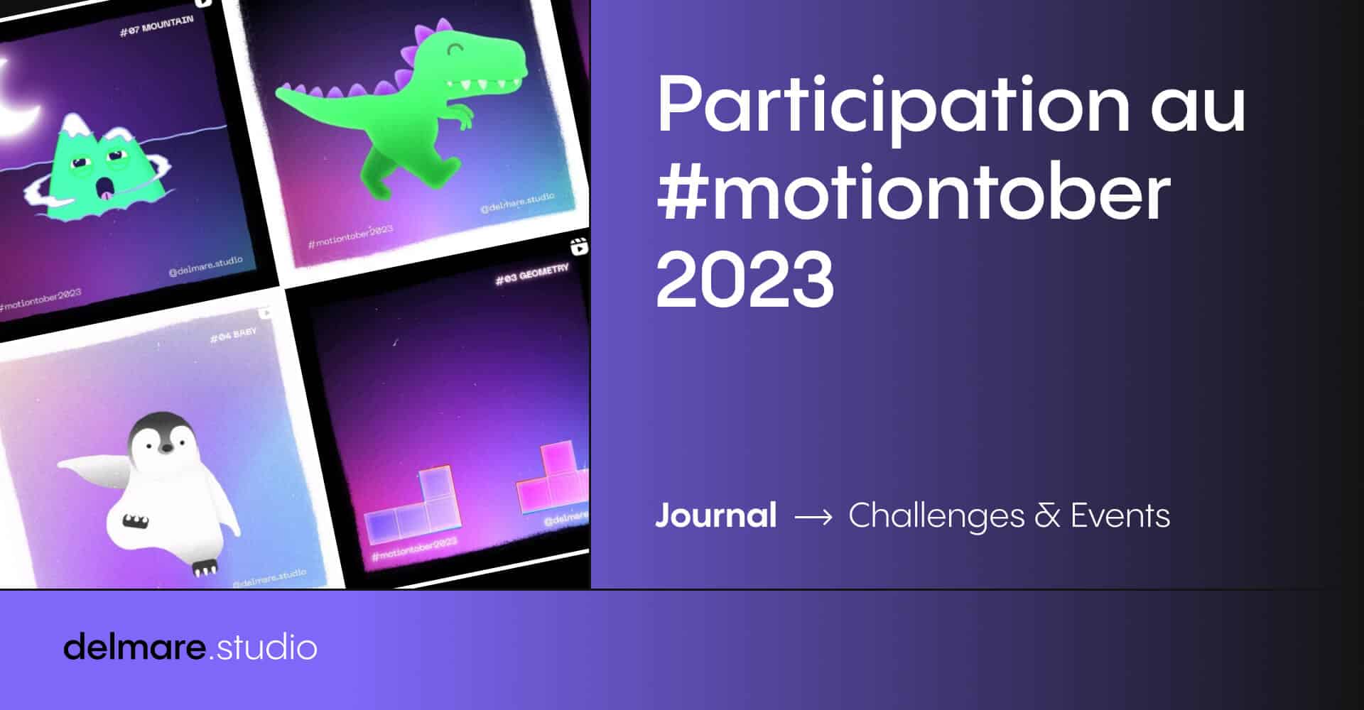
Le Motiontober organisé par Qimono est basé sur le même principe que le Inktober et concepts similaires, 1 jour, 1 thème, 1 animation ! Lire la suite
-
Compilation d’intégrations Lottie #1
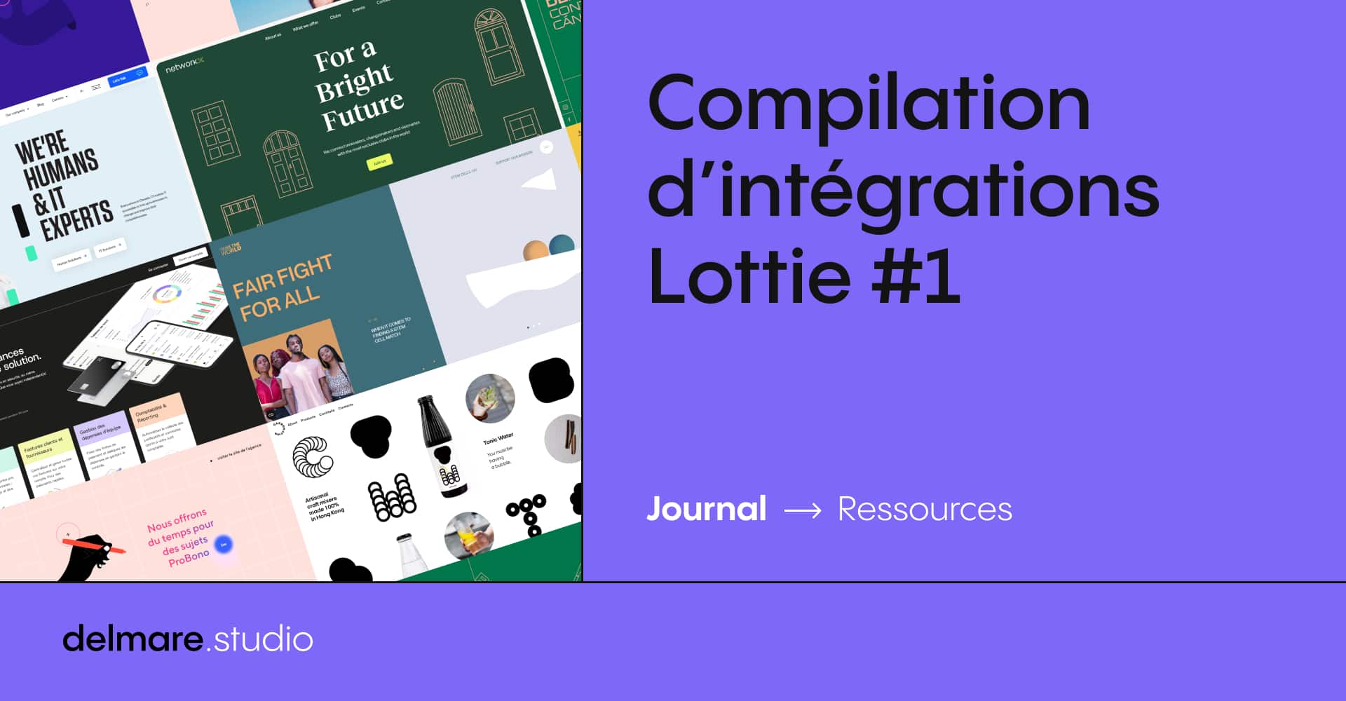
Nous vous proposons cette première compilation d’intégrations Lottie pour découvrir les bons et différents usages de la techno. Lire la suite
-
Qu’est-ce qu’une animation Lottie ?
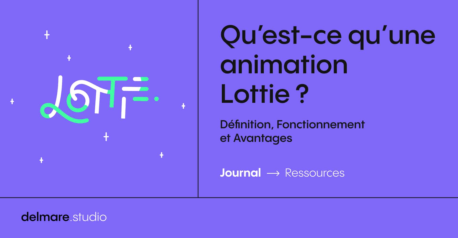
Découvrez Lottie, les origines de la techno, comment elle fonctionne et quels sont les quatre gros avantages de ces animations. Lire la suite
-
Décryptage des livrables en Broadcast Design
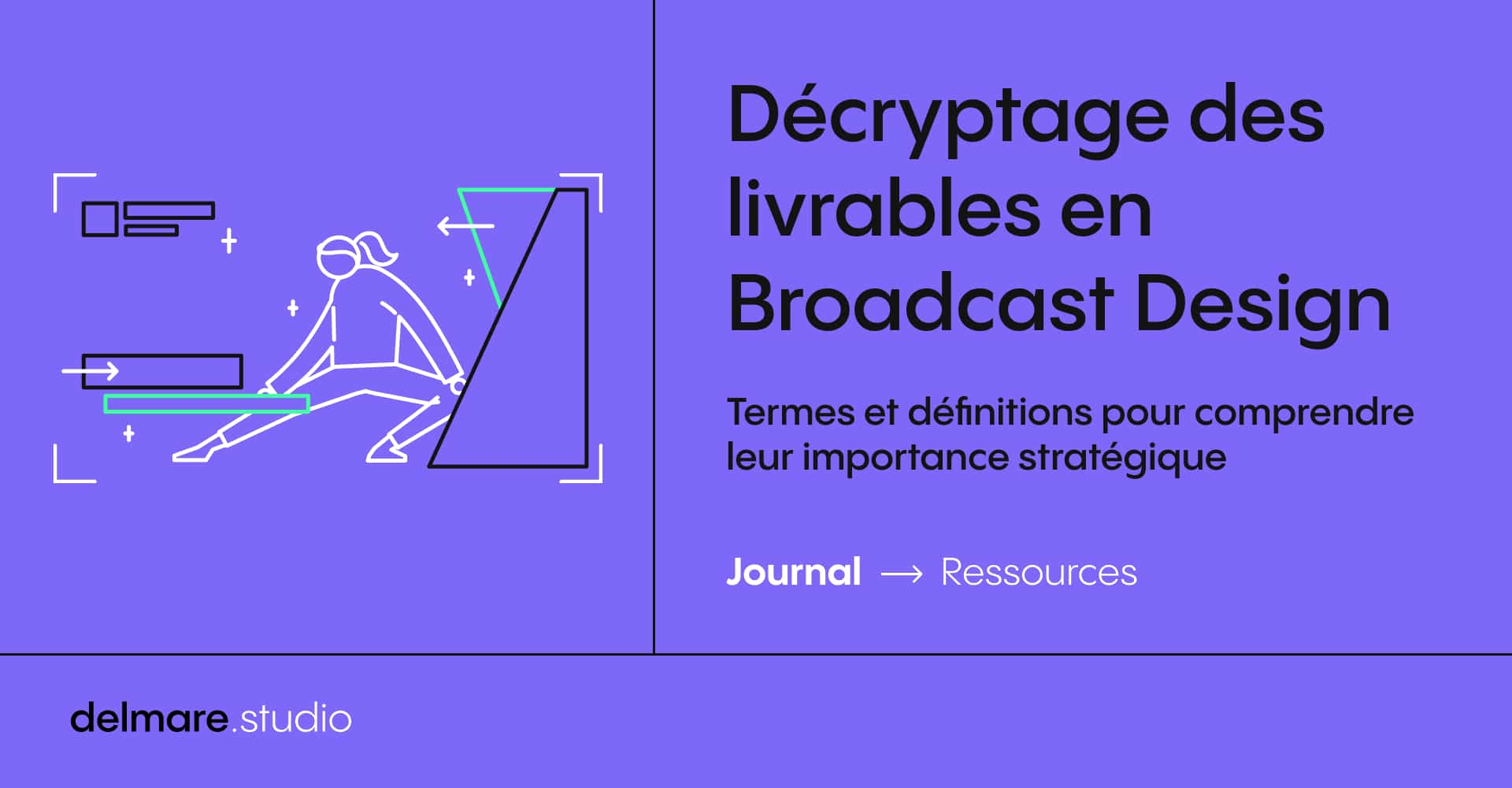
8 termes et définitions indispensables pour mieux comprendre le Broadcast Design, ses livrables et leurs enjeux. Lire la suite
-
Quelles sont les étapes de création d’un Motion Design ?
Découvrez les différentes étapes de création d’un motion design, depuis l’élaboration du script jusqu’aux exports et déclinaisons finales. Lire la suite
-
How to export MXF for TV or VOD ads broadcast – Adobe Media Encoder
I’ve been struggling a few times now when my clients ask me to export small tv spots for tv or online tv ads diffusion. This is why I’m gonna try to make it clear (in my own way, as a newbie in this domain) for those who might be in my situation. Lire la suite
-
How to round numbers in After Effects
You probably already looked for it on internet… You probably crushed your head into the table trying to round numbers in your composition on After Effects! Here is the solution: math.round(); Lire la suite